E.ON SE — 2022
E.ON — The path of electricity
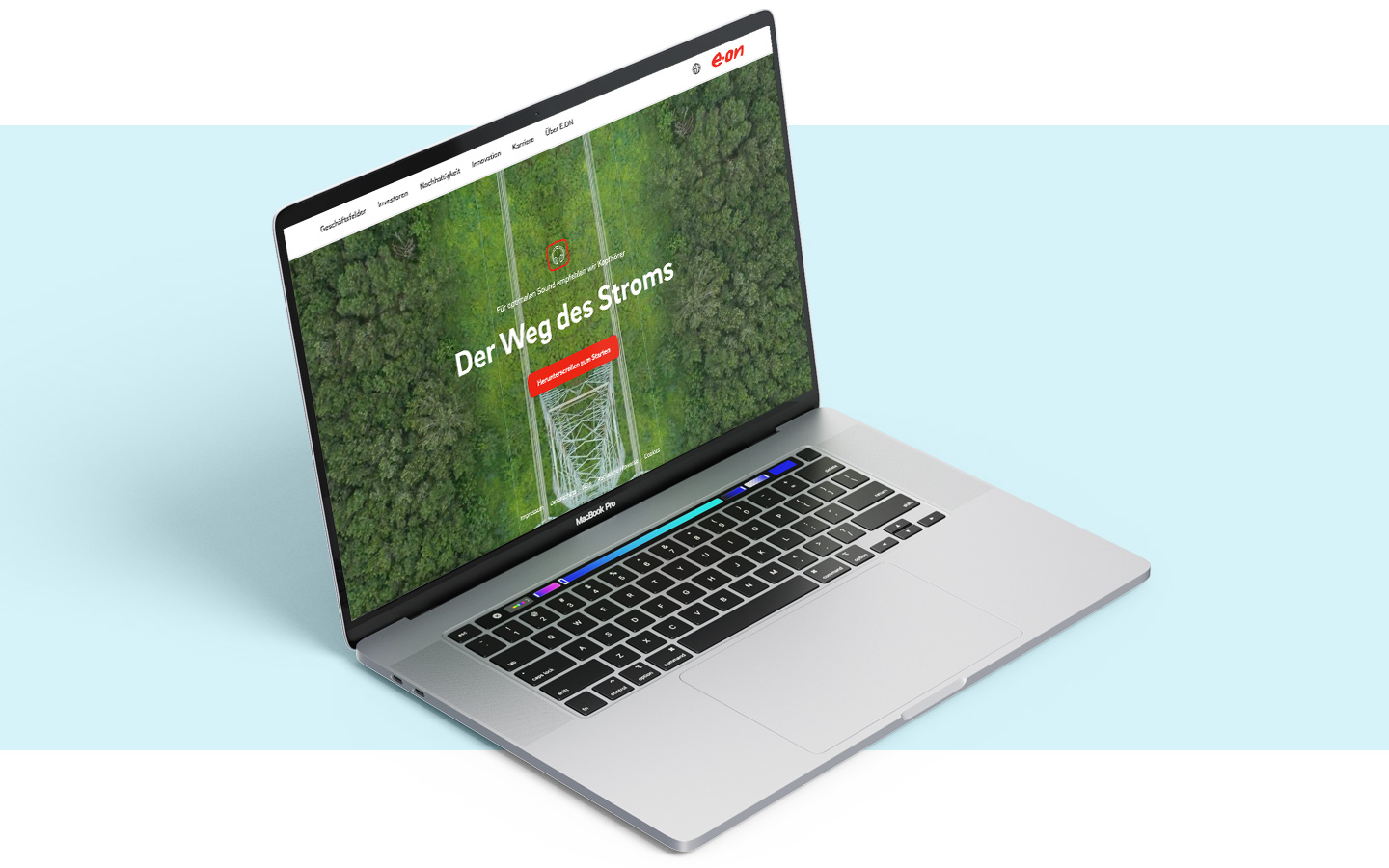
An interactive scrollytelling website tracing electricity from a North Sea wind farm all the way to the consumer's wall socket — built around drone footage shot across Germany, with a parallel mobile experience designed from the ground up.
- Role
Visual concept · Videography planning · Mobile UI
- Client
E.ON SE
- Type
Agency work
- Year
2022
Making an invisible infrastructure visible
E.ON is Germany's largest electricity distribution network operator — a role that is enormous in scale and almost entirely invisible to the people it serves. The brief was to take that invisible infrastructure and turn it into something a layperson could feel: a single, continuous journey from where electricity is generated to the moment it powers a kettle.
(text: The output was an interactive scrollytelling experience anchored in real aerial footage rather than illustration — the route had to be a literal route, shot across Germany, end to end. class: muted)
Three threads, running in parallel
- Visual concept. Defining the look and pacing of the drone sequences — what each leg of the journey should communicate, and how the cuts and transitions should carry the viewer from offshore wind to the substation, the pylon, the street, the home.
- Drone videography planning. Mapping the physical route the drone pilot would fly — locations, framing, time of day, transitions between segments — so that the edit could be assembled into one continuous journey rather than disconnected B-roll.
- Mobile UI. Designing the mobile version of the experience, where scrollytelling has to work without a mouse, without hover, and within a viewport that strips away most of the cinematic real estate of the desktop view.
A single journey, shot for real
The conceptual decision that shaped everything else was to commit to actual aerial footage of the actual route. No CG fly-throughs, no stylised maps — every leg of the path is a real place, shot from above, edited so the cuts feel like one continuous descent from the North Sea coast to a domestic socket.
That decision had downstream consequences for everything: shot framing had to anticipate the transition into the next shot; pacing had to leave room for the narration and ambient sound; colour had to remain coherent across drastically different locations and times of day.

Routing the pilot, frame by frame
Planning the videography meant translating the visual concept into a logistics document the drone pilot could actually fly. Each location was mapped with intended framing and altitude, an entry direction, an exit direction, and the cut it would lead into — so that on edit the camera appears to keep moving along the same continuous path even when individual takes were filmed weeks apart.
This meant the boring parts of pre-production — checking flight permissions, tide times for offshore shots, golden-hour windows for the inland legs — were as load-bearing as the creative ones. A beautiful shot in the wrong direction would have broken the illusion the entire site was built around.
“The whole experience is one continuous shot — except it isn't. The job was making sure you couldn't tell.”
The same journey, in a portrait frame
Designing the mobile experience was its own problem. A 9:16 viewport cuts off most of the drone framing the desktop relies on; touch removes hover affordances; thumb-driven scrolling changes the pacing of every transition. The mobile UI was designed in parallel rather than as a downscaling — re-cropping key sequences, replacing hover-only hotspots with tap-targeted equivalents, and pacing the scrollytelling so the journey still feels continuous on a phone in one hand.


Live at eon.com, shortlisted twice
The site launched at eon.com/weg-des-stroms as E.ON's public-facing explainer of the distribution network. The project was subsequently shortlisted at the DCA (Digital Communication Awards) and the DPOK (Deutscher Preis für Onlinekommunikation).